Redesign E-commerce Website for Accessibility

Redesign E-commerce Website for Accessibility

Overview

Overview

To create an inclusive online shopping experience, I did an accessibility evaluation for CHARLES & KEITH US website and produced an accessibility evaluation report describing the conformance of the Charles & Keith US website with W3C’s Web Content Accessibility Guidelines (WCAG) 2.1 Level AA. In this project, I provided design mockups for visible changes and actionable actions in the end.

My Role

Accessibility evaluation

Draft accessibility report

Create design mockups

1 week

Duration

Tools

WAVE evaluation tool

ANDI tool

WCAG

Figma

My Role

Accessibility evaluation

Create accessibility report

Create redesign mockups

Duration

1 week

Tools

WAVE evaluation tool

ANDI tool

WCAG

Figma

Why Accessibility Matters in Online Shopping ?

Why Accessibility Matters in Online Shopping ?

Online shopping has become more and more popular in recent years, especially after the global pandemic. The rise in e-commerce brings people a more convenient and enjoyable way to shop at home.

However, can everyone enjoy these convenience and enjoyment? Is anyone left behind?

26%

adults in the US have some type of disabilities.

69%

of consumers click away from websites they find difficult to use.

73%

of disabled consumers experience accessibility barriers on more than one in four websites.

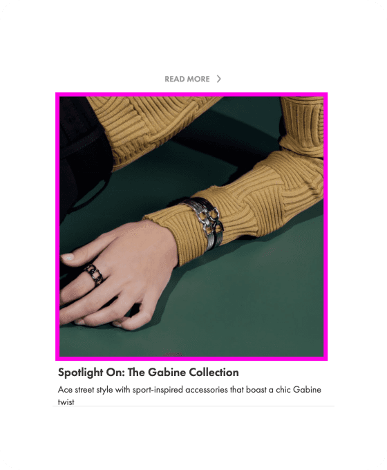
Online shopping, especially in fashion insustry, can be really frustrating for people with visual impairment, since it relies a lot on visual cues.

When you finally cave and make your way to the website, all you’re met with is unreadable text, a cluttered outlay and a voice repeating ‘button, button, button.’

When you finally cave and make your way to the website, all you’re met with is unreadable text, a cluttered outlay and a voice repeating ‘button, button, button.’

Elin Williams, A UK girl diagnosed with a degenerative eye condition

Elin Williams, A UK girl diagnosed with a degenerative eye condition

Start from Accessibility Evaluation

Start from Accessibility Evaluation

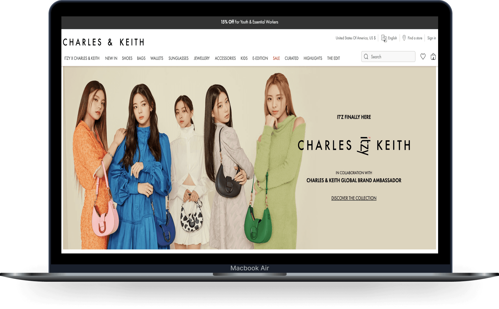
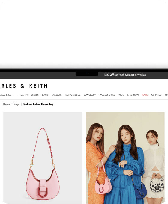
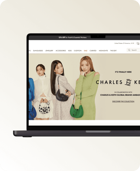
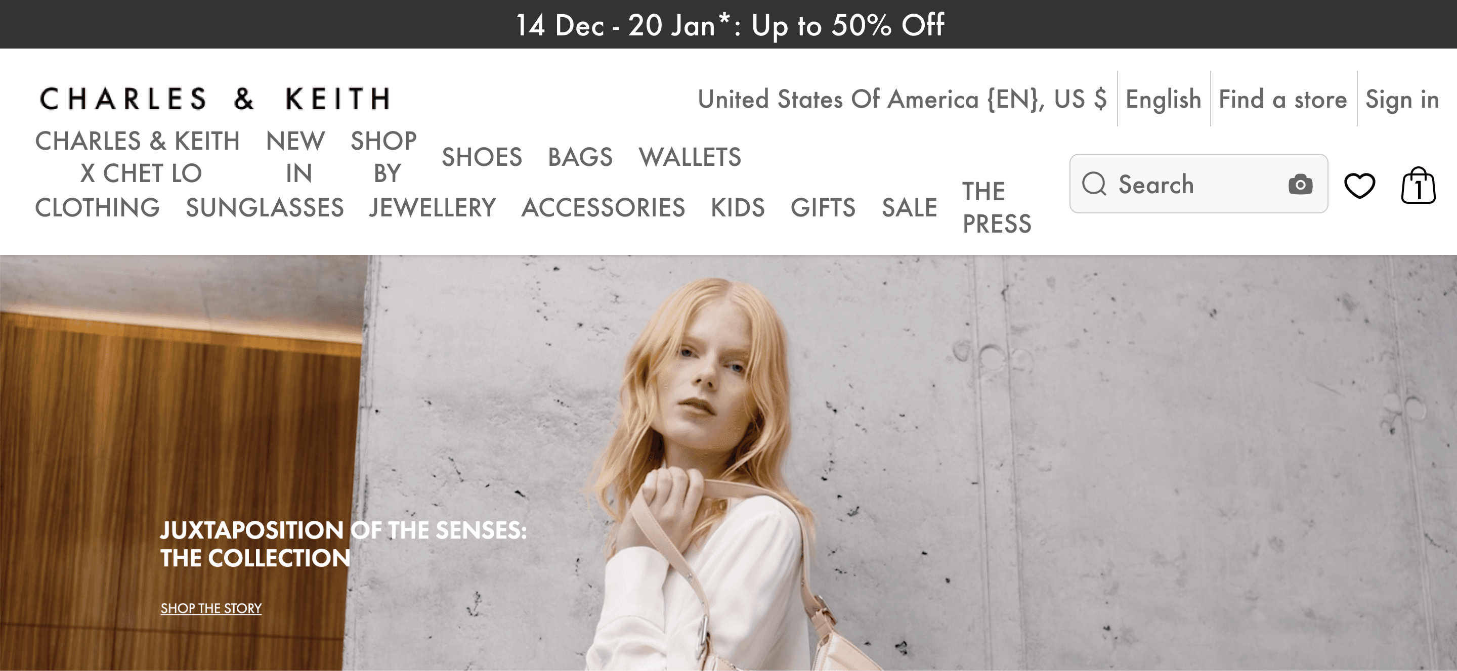
In this project, I evaluate CHARLES & KEITH US, a website for shopping shoes, bags, and accessories, not only because I am a user, but also I found some accessibility issues when doing the first easy check. I focus on the homepage and product page.
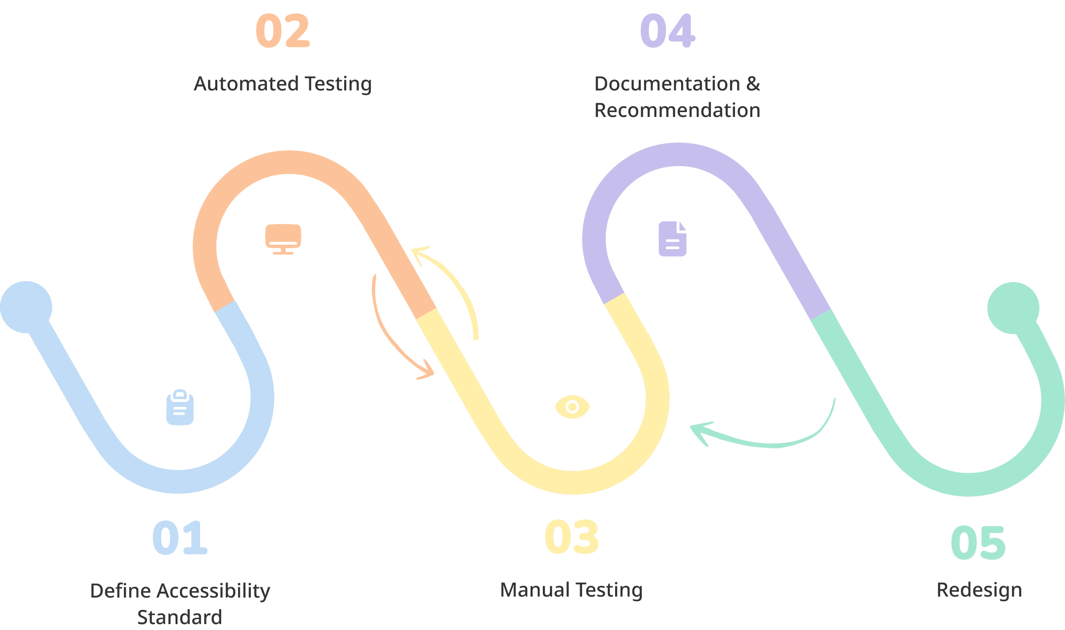
EVALUATION PROCESS

How I Evaluate?

This is an overview of how I evaluated the website and what tools and methods involve along the process.

01

Define Accessibility Standard

WCAG 2.1 AA

TOOLS

WCAG Easy Check

WCAG Evaluation Tool

02

Automated Testing

Scan the website for defining common issues

  • Color contrast

  • Missing alt text

TOOLS

WAVE evaluation tool

ANDI

03

Manual Testing

  • Keyboard Accessibility

  • Check semantic structure of the HTML markup to ensure content hierarchy

  • Check alt text and label

  • Check text resize state

  • Check color contrast

TOOLS

Zoom Text Only Plugin

WebAIM Contrast Checker

04

Documentation

  • Document evaluation results

  • Provide recommendation for next step and priority

TOOLS

WCAG Evaluation Tool

05

Redesign

Create design mockups

TOOLS

WebAIM Contrast Checker

Stark - Contrast and Accessibility Tool

Evaluation Result

I reported on 48 of 50 WCAG 2.1 AA Success Criteria. This website appears to not meet WCAG 2.1 AA with 18 passed criterion, 22 failed criterion, 8 criterion not present, and 2 not checked.

18

passed

22

failed

8
not present
2
not checked

18

passed

22

failed

8
not present
2
not checked

The Problems.

Alt Texts are missing and fail to provide engaging shopping experience.

Problem

Missing alt text found for shopping cart icon. Screenreader users will fail to access the shopping cart.

Problem

The same product in different angles or context share the same alt text.

Problem

Alt text for the cover fail to let screenreader users 'see' how the celebrity dress up, but only the product name.

Approach

Work with content creators, UX writer to make Alt Text actionable, detailed and vivid for engaging and intuitive shopping experience in screen readers.

Poor Color Contrast at UI makes users with visual disabilities hard to navigate.

Problem

Color contrast does not meet WCAG AA criteria. Users with visual impairments may fail to perceive the button.

Problem

Color contrast does not meet WCAG AA criteria. Users with visual impairments may fail to navigate through the site.

Approach

Increase Color Contrast.

Before

Originally, the website uses color to differentiate active and inactive tab while not satisfying color contrast.

After

To meet color contrast while making clear the tab state, I remove the underscore for the inactive tab.

Some items cannot be reached by keyboard.

Some visual cues fail to provide guidance.

Approach

Make sure the cue is understandable and clear enough to perceive.

Before

The color of visual cue makes it hard to perceive when the color is too close to the image.

After

Use bright color to convey keyboard cue.

Before

It's not clear to tell which item the cue is pointing to.

After

Design the cue to be clear and intuitive.

Balance between Business Need and Accessibility.

Before

Placeholder and alt text do not communicate what to input to subscribe.

After

Balancing business (emphasizing signup benefit) and user needs, I decided to convey the benefits via the subtitle above. Keep placeholder and alt text input action.

Poor Readability after resizing fonts to 200%.

Problem

Text gets cut off, disappears, or

overlapping.

Problem

Users need to scroll nav bar horizontally to read entirely.

Approach

Optimize Layout to accommodate with

vary font sizes.

Before

After

Alt Texts are missing and fail to provide engaging shopping experience.

Approach

Work with content creators, UX writer to make Alt Text actionable, detailed and vivid for engaging and intuitive shopping experience in screen readers.

Poor Color Contrast at UI makes users with visual disabilities hard to navigate.

Approach

Increase Color Contrast.

Some items cannot be reached by keyboard. Some visual cues fail to provide guidance.

Approach

Make sure the cue is understandable and

clear enough to perceive.

Balance between Business Need and Accessibility.

Poor Readability after resizing fonts to 200%.

Approach

Optimize Layout to accommodate with

vary font sizes.

The Problems.

Beyond Guidelines, what can we do next?

Beyond the guidelines, what are other opportunities to make the end-to-end shopping experience more inclusive?

Empathizing with screenreader users, these are the questions I’m thinking about:

What are the pain points screen reader users have when listening to the the alt text?

Are the alt text enough for people with visual disabilities to imagine the items like average users do?

Recruit the users! Do NOT based on our assumptions

For next step, it’s crucial to recruit users with disability to understand their real experience on the website and the pain points they have. Doing user research directly with the disabilities allows us to truly empathize with people’s conditions and understand their hidden story, leading us to design with a more inclusive mind.

Explore more projects

Explore more projects

Let's connect and collaborate!

Let's connect and collaborate!